The creative club
creating an app to Supporting Artists and Performers Impacted by COVID-19
Project Type:
iOS Mobile Application
Role:
Duration:
UI Designer and UX Researcher
4 months
The Design Process:
Problem
COVID-19 has significantly impacted the performing arts industry, limiting opportunities for live performances and reducing income for artists. Many performers, especially amateurs, struggle to connect with employers and showcase their work in a safe, virtual environment.
Stepping into Performers' Shoes: Understanding Their World
As Jack Dorsey once said: "If you want to build a product that’s relevant to people, you need to put yourself in their shoes." This principle guided the approach to understanding the challenges faced by artists during the pandemic.
I started by conducting research into the issues artists were facing globally, focusing on local, regional, and international perspectives. With the rapid shift in how people interact with technology, I wanted to understand both the immediate and long-term struggles that artists were experiencing.
empathize
Solution
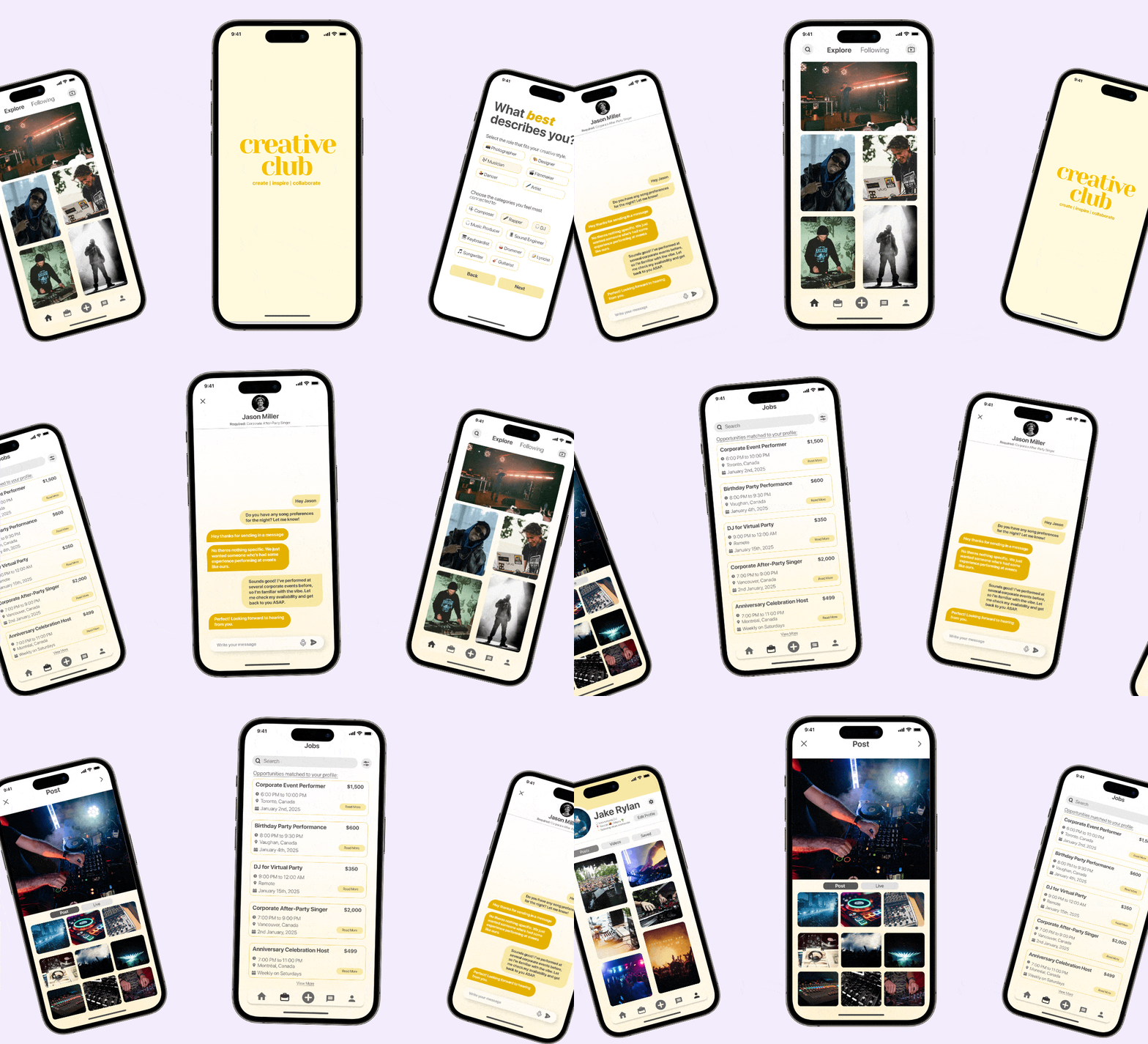
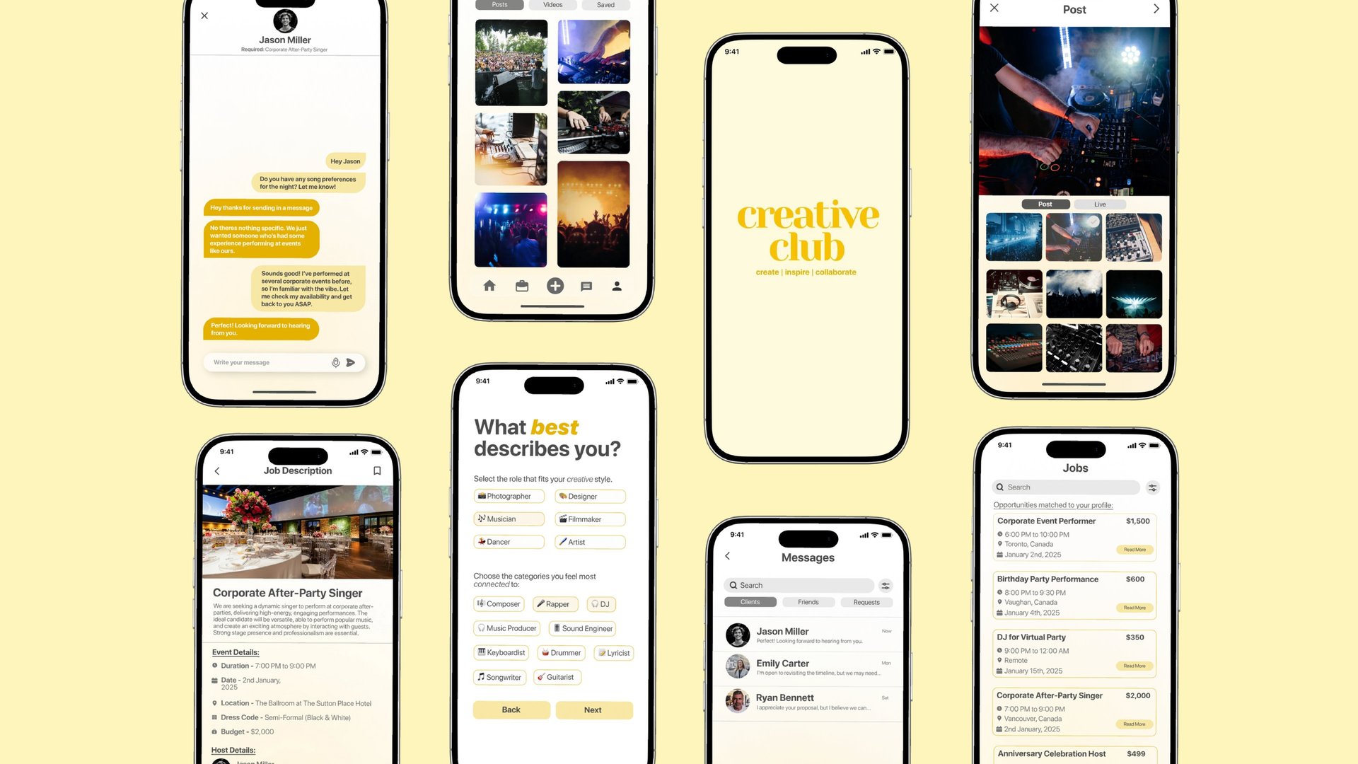
The proposed mobile app helps artists showcase their portfolios, apply for job opportunities, and communicate with employers, creating a platform for remote performance opportunities and industry connections during the pandemic.
High Fidelity Prototype
After identifying key issues faced by both customers and service providers, I developed a streamlined design system to accelerate the design process. This system introduced standardized components and styles, ensuring consistency while enabling rapid iterations.
By creating a cohesive framework, I was able to address usability concerns more efficiently and provide a clear, adaptable structure that would support both user and business needs as the project moved forward.


User Interviews
To gather deeper insights, I interviewed six artists—musicians, dancers, and actors—and asked key questions such as:
"How has the pandemic affected your ability to find gigs or perform?"
"What challenges have you faced transitioning to an online performance environment?"
"Do you find it difficult to collaborate with other artists during this time?"
"What would make it easier for you to connect with employers or other performers?"
From these interviews, several common themes emerged:
A standout statement came from a musician who said,
"It's almost impossible to find online gigs unless you're already established; smaller artists don't get noticed."
A dancer expressed frustration, stating, "Dancing is meant to be performed live—doing it online doesn't capture the energy or the connection with the audience."
Another interviewee, an actor, shared, "The online space feels saturated, and it’s difficult to make meaningful connections with potential collaborators."
What I Discovered
These insights revealed several key pain points faced by performers during the pandemic:
Preference for Established Performers: Smaller, lesser-known artists struggled to secure gigs, as larger companies preferred to hire more famous performers for online events.
Maintaining Audience Engagement: Performers found it challenging to engage with their audience in a virtual setting, as the energy and connection of live performances were difficult to replicate online.
Adapting to Digital Platforms: Some performers had difficulty transitioning to online platforms, with varying levels of comfort and experience using social media and streaming tools.
Increased Reliance on Technology: Artists were increasingly using technology to replace live performances, but this shift was often fragmented and lacked cohesive support to help them thrive in a digital space.
Using user personas, empathy maps, and journey maps, I gained valuable insights into the user experience. This understanding enabled me to create a technology-driven solution that connects artists with new opportunities in the digital landscape.

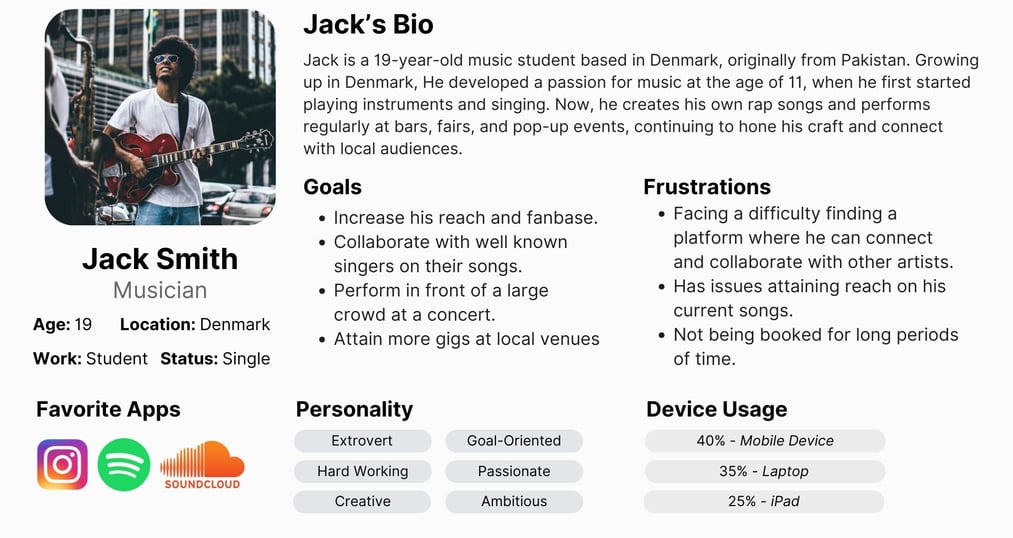
Initially, I considered creating a single persona, but decided to develop multiple to better capture the diverse needs of users. These personas, detailing goals, frustrations, preferences, and preferred devices, became key references throughout the ideation and development process.
User Personas
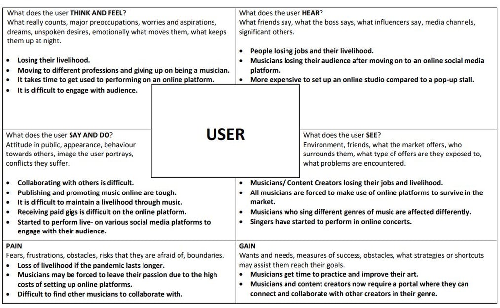
Empathy Map
Empathy maps are an effective tool for capturing a user’s thought process, allowing me to record insights into their thoughts, beliefs, and motivations. I created an empathy map for one of my users, Jack, to capture his specific needs and concerns. This map was invaluable during the prototyping stage, helping me ensure that my solution addressed the key challenges and preferences identified.
Defining the Challenge: Crafting a Vision
After gathering insights from the research phase, I analyzed the information to narrow down key problems and frame a specific design challenge: “Create a platform tailored for creators, equipped with features that meet their unique needs.”
I then translated the broad challenge into user-centered need statements, aligning each with the issues identified in the Empathy stage. This approach ensured the design process remained focused on the user, not just on adding technological features.
Key user need statements included:
“Simplify the platform by removing unnecessary features, making it more user-friendly.”
“Provide profile-specific tools for creators to enhance flexibility and usability.”
“Consolidate features from various platforms to give users one comprehensive toolset.”
This approach allowed me to maintain a clear, user-centered focus, ensuring each statement addressed a genuine user need without rushing to a specific solution.
Ideating Solutions: Turning Insights into Ideas
With a clear understanding of the problem, affected demographic, and user needs, I moved into the ideation phase. To begin broadly and narrow down effectively, I drew on insights from the Empathy and Define phases, using user personas and need statements to generate ideas that aligned with users’ mental models.
I started brainstorming using the NOW-WOW-HOW approach, setting a 15-minute timer to generate as many ideas as possible, then organizing them into a matrix. While this method encouraged creativity, I found that the SCAMPER technique provided more structured and valuable insights for ideation.
After evaluating my ideas, I identified an online solution as the most feasible but kept other options open to ensure comprehensive consideration of user needs.
Prototype and Test Stage
After completing the Ideation phase, I concluded that a mobile app would be the most suitable solution for this scenario. The prototyping and testing phases proved to be some of the most time-intensive and iterative stages of the entire design process. Here’s a timeline of each step I took to transform my idea into a fully interactive prototype.
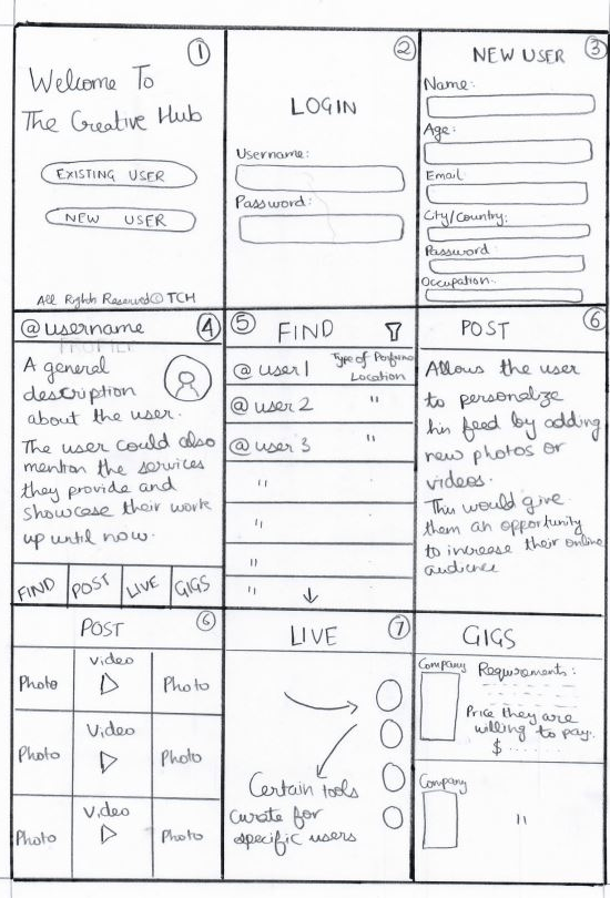
Initial Sketches - Low Fidelity Prototype
To start bringing my ideas to life, I began with simple sketches. I used a 3x3 grid to map out all the key elements of my solution, visually representing concepts from the ideation stage for the first time. The sketching process also inspired new ideas and allowed me to refine initial concepts, highlighting areas that would not be feasible to implement.
One key issue from user research was the difficulty of filtering creators by genre on existing platforms. My solution addresses this by categorizing users by their specific field within the performing arts, making it easier for creators to connect with others in similar areas.
Storyboard
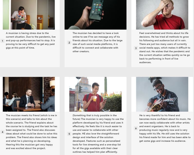
To bring my solution to life, I created a storyboard that illustrates a hypothetical scenario involving a friend who is a creator interacting with the app I designed. The sequence follows his journey: initially, he is concerned about his career prospects due to COVID-19 and the loss of live performance opportunities. Then, he meets with me, where I introduce the app as a solution for connecting creators with virtual gigs. This conversation leaves him feeling hopeful about new possibilities. A few months later, he begins using the app, successfully finding paid gigs and growing his audience, ultimately expressing gratitude for the platform’s positive impact on his career.
Cognitive Walkthrough
For my first round of rapid prototyping, I conducted a cognitive walkthrough with local friends and family, providing them with materials to complete the testing.
The walkthrough focused on three main features:
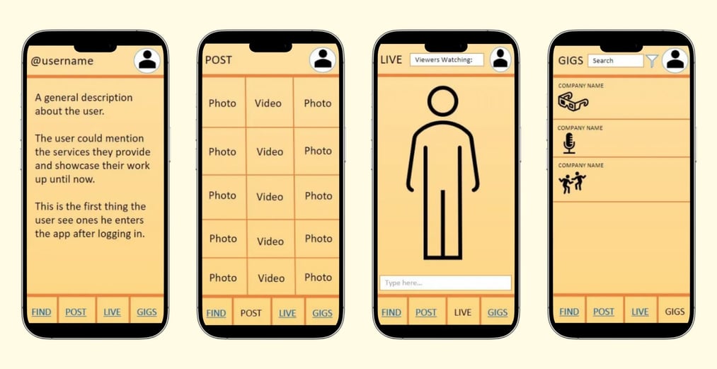
posting content, live streaming, and finding gigs. I kept the design simple, which helped evaluators complete tasks with ease. However, feedback highlighted usability improvements needed in the paper prototype.
Key findings:
No back navigation option between screens.
Lack of a home page made navigation difficult.
Absence of intuitive buttons for posting or live streaming.
Medium-Fidelity Prototype
Incorporating feedback from the paper prototype, I refined my design into a clickable, interactive medium-fidelity prototype using Figma. This allowed users to engage directly with key features, improving their understanding of the solution’s functionality. I then carried out two rounds of user testing—Think-Aloud Testing and Heuristic Evaluation—to gather further insights and refine the prototype.
Think Aloud Testing
To evaluate usability, I conducted think-aloud testing with two friends from the performing arts field. They highlighted usability issues, such as confusion around posting content, particularly lacking buttons for uploading photos or videos. I addressed this by adding a clear “+” icon to streamline content creation.
I conducted a heuristic evaluation with two evaluators, one friend and one family member, which revealed usability gaps in error prevention and navigation. This feedback guided further refinements, enhancing the prototype’s usability and making it more intuitive for users.


Heuristic Evaluation
Here are the key insights gained from the evaluations, each driving meaningful improvements to the user experience:
Enhanced Usability Through Iteration: Iterative prototyping allowed for incremental enhancements, refining the prototype with each user testing round.
Immediate Usability Concerns: Think-Aloud Testing surfaced immediate usability issues, helping address points of confusion for users engaging with key features.
Detailed Usability Checks: Heuristic Evaluation revealed subtle gaps, like the absence of error prevention and lack of help/documentation, which might otherwise go unnoticed.
Impact of Minor Adjustments: Small changes, such as adding “help” buttons, had a significant effect, underscoring how minor details can greatly improve usability and guide users effectively.
These insights underscored the importance of diverse evaluation methods, showing how they each contribute uniquely to enhancing the prototype.
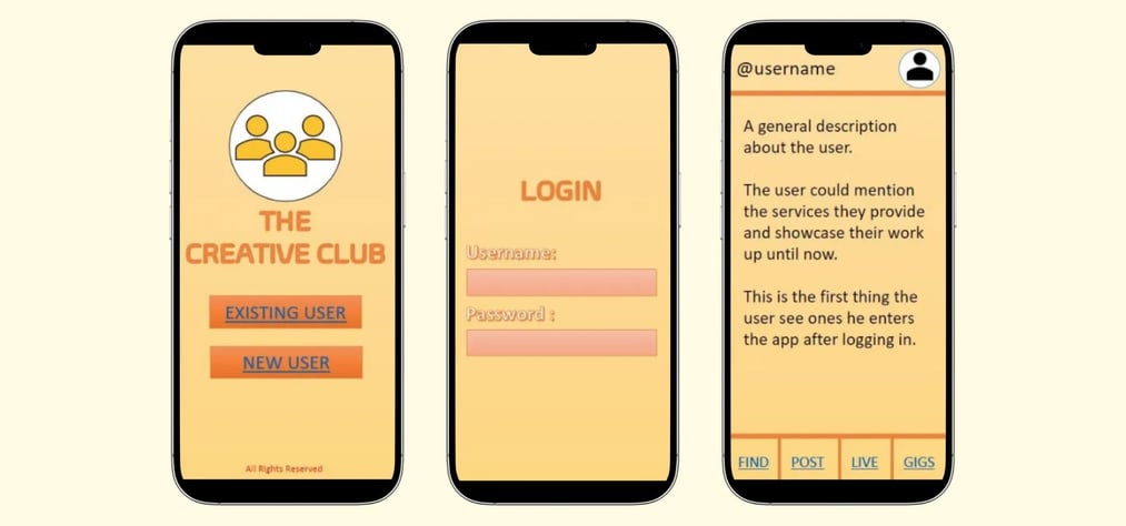


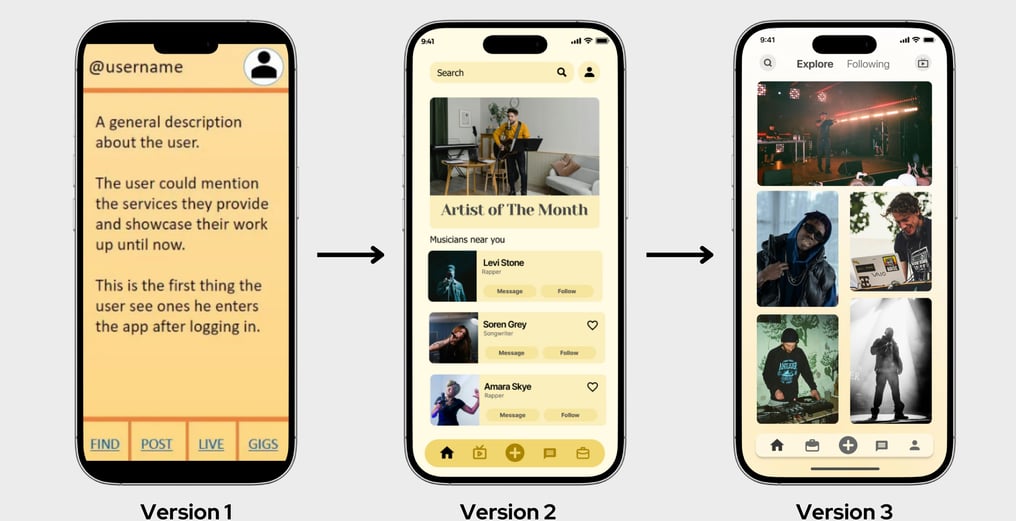
The iterative UX/UI improvements combined visual hierarchy and interaction design based on rapid testing and user feedback:
Version 1: The homepage was static and text-heavy with minimal interactive elements, offering limited engagement.
Version 2: Sections like "Artist of the Month" and "Musicians near you" were added to improve content clarity and usability, alongside the introduction of "Follow" and "Message" buttons to encourage social interactions.
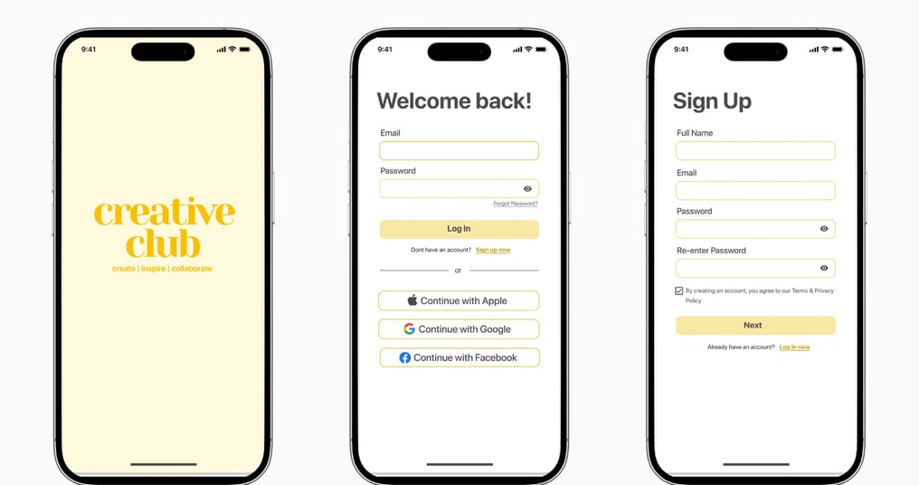
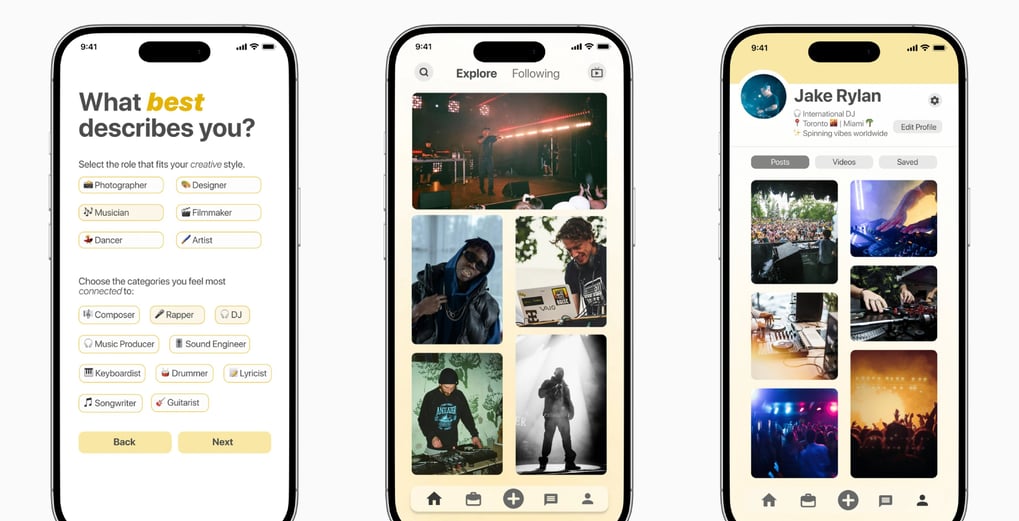
Version 3: The design transitioned to an image-centric grid layout for better visual discovery, streamlining interactions and focusing on exploration, making the overall experience more dynamic and user-focused.
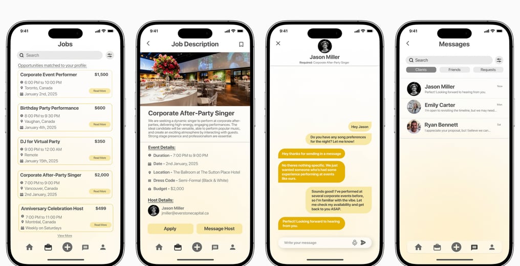
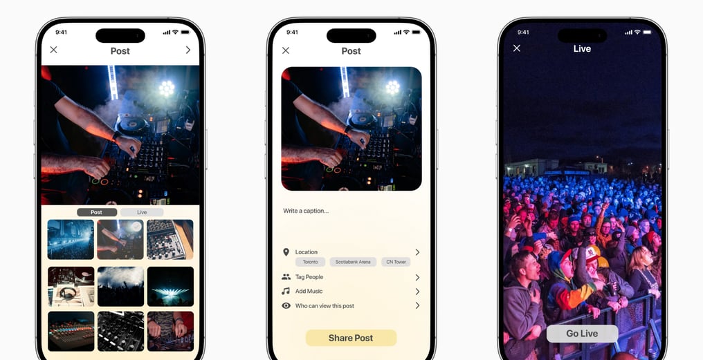
Following the iterative improvements to the visual hierarchy and interaction design, here are the other final screens for the application. These reflect the refinements that were made based on user feedback, providing a more engaging and intuitive user experience:
Key Takeaways and Learnings
Clarity Through Simplicity: Stripping down complex features and focusing on core functionalities allowed users to quickly grasp the app’s purpose. A clean, minimal design not only enhanced usability but also reduced cognitive load, making the experience seamless and intuitive for performers to connect with new opportunities effortlessly.
Iteration and Rapid Testing Drive Improvement: The iterative process of prototyping, testing, and refining played a key role in shaping a more functional and user-friendly product. Feedback from cognitive walkthroughs, think-aloud testing, and heuristic evaluations provided valuable insights that allowed for continuous improvement, refining both the design and usability.
Future Improvements: Adding a system where users can rate and provide feedback on gigs, employers, and collaborators would help improve trust and transparency within the platform. This feature could also be used to refine the app’s content and performance suggestions.
Tools:
Figma, Photoshop
